keep in mind i am still an amatuer, but its better than nothing right?


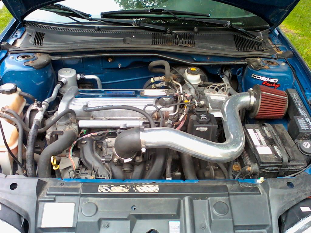
and another quick one, i thought it would be cool to change the color of your intake. tried to blend your name into there, don't think it turned out perfect, but it's better than nothing right?
i actually ordered the intake in polished as opposed to blue because i didn't end up liking the look of it. but thank you for the attempts justin.

jschristian44 wrote:
and another quick one, i thought it would be cool to change the color of your intake. tried to blend your name into there, don't think it turned out perfect, but it's better than nothing right?
You should really give up.... because nothing is definitely better than that.
Paying someone to install parts and bragging about it being fast, is like watching someone bang your wife and being proud to raise their kids.
Not my best work but oh well... here ya go.


always someone who makes better ones than me

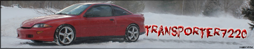
z yaaaa wrote:other than the nasty hood dent, steelies, 4X4 ride heidt, crooked front license plate, body color b pillar covers, 2200, lack of tint, and overall boringness of the car id say she's perfect!
If you added a shadow under the car and didn't stretch it out, it would be perfect.
i can fix the stretch, but dont know how to shadow. im new and using GIMP
z yaaaa wrote:other than the nasty hood dent, steelies, 4X4 ride heidt, crooked front license plate, body color b pillar covers, 2200, lack of tint, and overall boringness of the car id say she's perfect!

figured out how to do it, but i did it quick and messed it up a bit
z yaaaa wrote:other than the nasty hood dent, steelies, 4X4 ride heidt, crooked front license plate, body color b pillar covers, 2200, lack of tint, and overall boringness of the car id say she's perfect!
That looks alot better.. keep messing around with it and you'll get better.
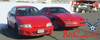
Red2.2cavi wrote:
figured out how to do it, but i did it quick and messed it up a bit
rather than creating a drop shadow on the image... to get the shadow right draw the shape, fill it, then feather the edges. you will get a much more realistic shadow.

Quiklilcav wrote:Miss Jazer wrote:rather than creating a drop shadow on the image... to get the shadow right draw the shape, fill it, then feather the edges. you will get a much more realistic shadow.
Truth. I usually draw out the shadow with the polygon select tool, then feather it and fill it with black, then lower the transparency setting until it looks natural.
Im addicted to the pen tool, I hand draw everything, create the shape, fill it, then I usually use a gaussian blurr to feather it, then change the transparency. lol.